Community Cleanup Volunteer Sign-Up
Designed a user-friendly sign-up interface for a community cleanup event, aimed at inspiring users to volunteer for a meaningful cause. The UI conveys a sense of community, environmental responsibility, and engagement, employing various techniques in Figma. The app encompasses several key features, enhancing user interaction and satisfaction:


Key Interfaces
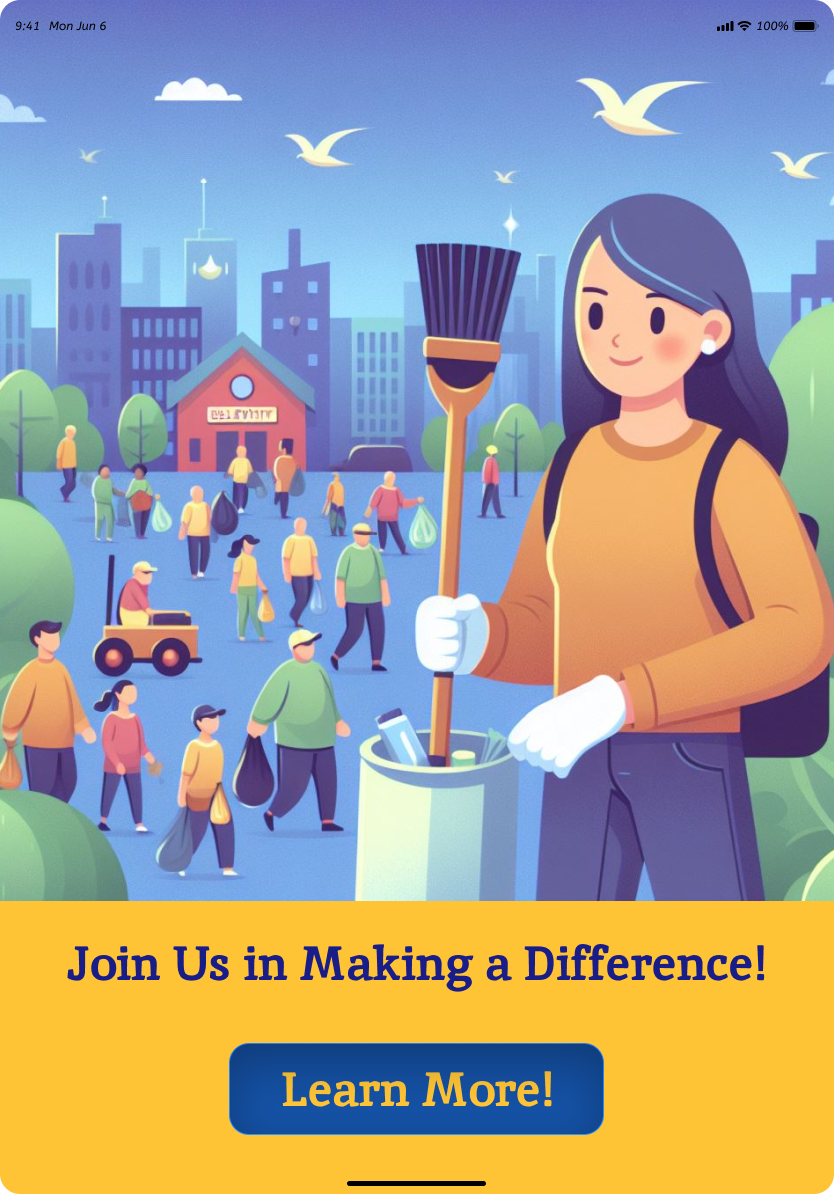
Home
- Catchy Headline: "Join Us in Making a Difference!"
- Color Palette: Vibrant and eco-friendly colors to create a positive and inviting atmosphere.
- Illustrations: Charming illustrations of people cleaning up a park and promoting a clean environment.
- Images: Nature, recycling symbols, and clean environment visuals to reinforce the cause.
- Button: "Learn more" button leading to the "Event Information" section.
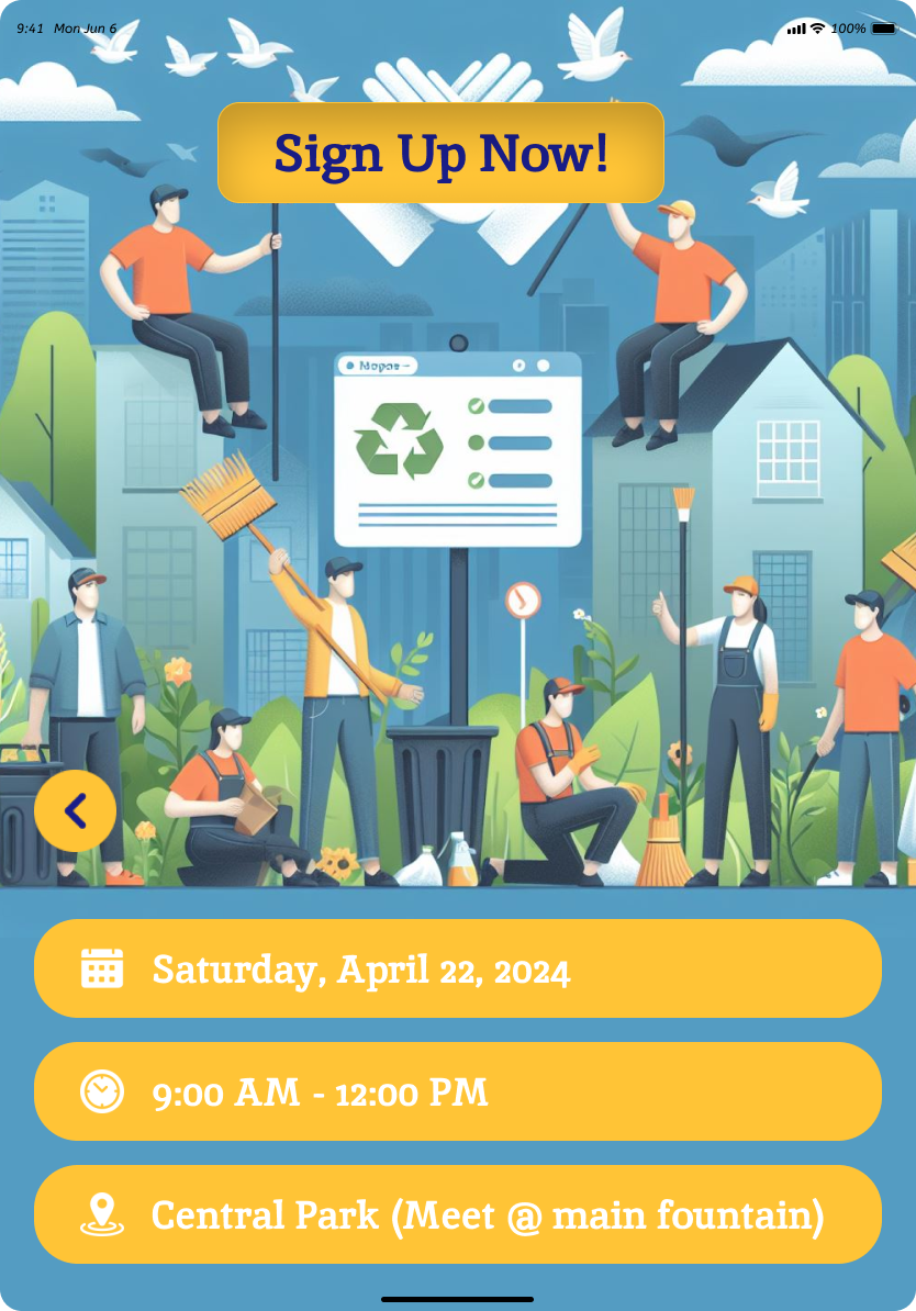
Event Information
- Details: Event date, time, and location displayed prominently.
- Illustrations: Continue charming illustrations of community members contributing to the cleanup.
- Images: Nature, recycling symbols, and clean environment visuals for a cohesive theme.
- Button: "Sign Up Now!" guiding users to the "Sign Up" section.
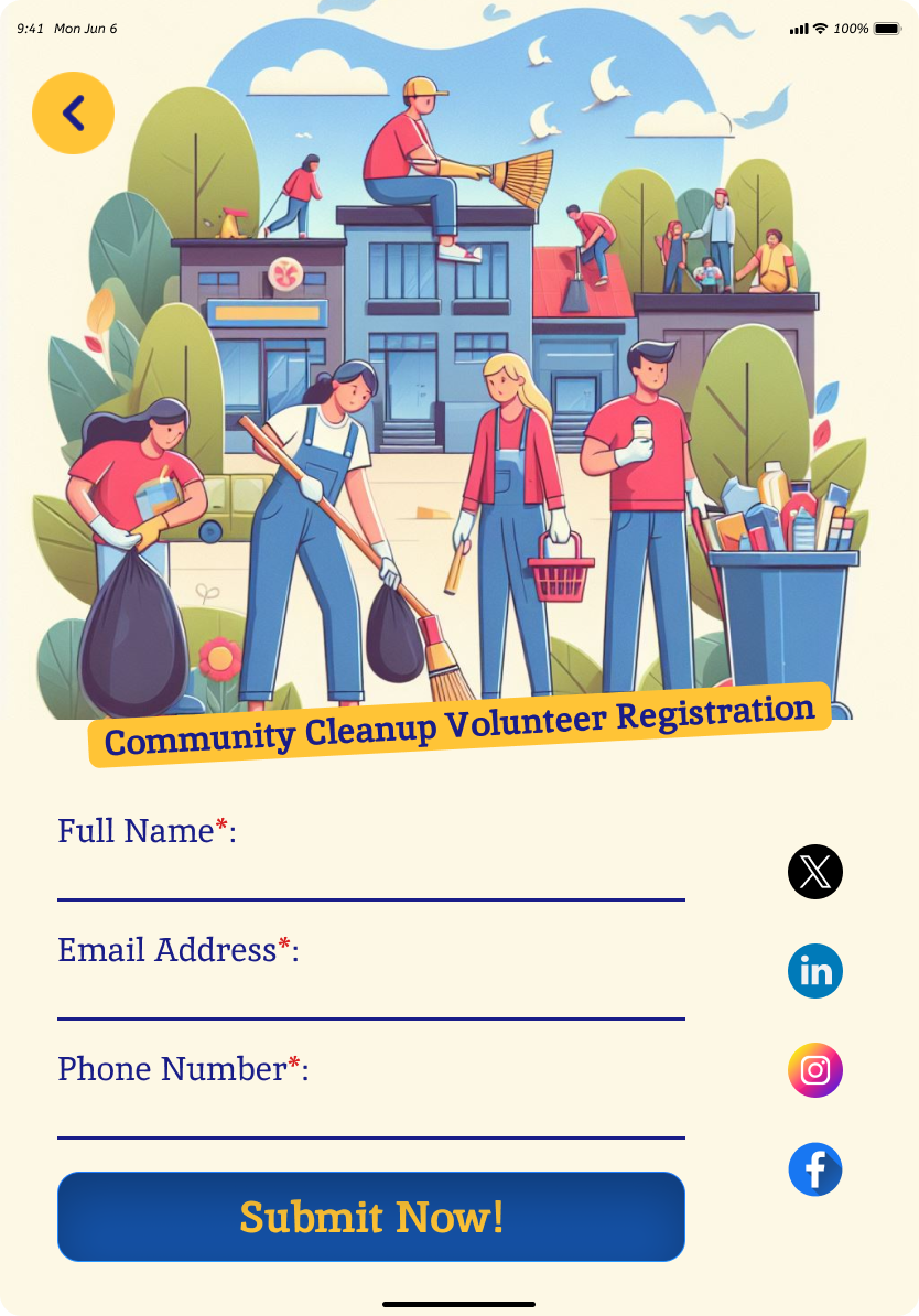
Sign-Up Section
- Form Fields: Collecting basic information - Name, Email, Phone Number.
- Illustrations: Continue to use charming illustrations, emphasizing the communal effort.
- Images: Nature, recycling symbols, and clean environment visuals to maintain the theme.
- Button: "Submit Now!" for submitting details.
- Social Media Links: Buttons to share the event on various social media platforms.
UI Techniques in Figma
- Typography and Colors
- Illustrations and Visuals
- Buttons and Navigation
- Consistency and Cohesion
- Responsive Design
Employed legible typography for clear communication. Utilized vibrant and eco-friendly colors for a positive impact.
Incorporated charming illustrations to evoke a sense of community engagement. Selected images of nature, recycling symbols, and a clean environment for visual appeal.
Designed visually appealing buttons with clear call-to-action text. Ensured smooth navigation between sections for a seamless user experience.
Maintained consistency in color palette, typography, and illustrations for a cohesive look. Created a visual theme that aligns with the community cleanup event's goals.
Applied responsive design principles to ensure a user-friendly experience across various devices.